
A Pet Adoption Digital Design
Helping connect animal lovers with the right companion for them
Take Home Challenge
Across the world, millions of animals are in shelters or foster homes, eagerly awaiting to be adopted. Design a digital experience that will help connect people looking for a new pet with the right companion for them.
Deliverables
Provide a low-level flow and sketched wireframes with annotations to support your recommendations.
Time Spent: 6 Hours
Tools Used: Google, Drive, Pinterest, Pen & Paper, Cell Phone
LEARNING & ANALYSIS

Step 1: Research Adoption Procedures
Before diving into any project I always try to put myself into perspective. Understanding the subject at a foundational level helps me better focus on the problem at hand. By doing this I researched different step by step guides on the adoption process, and also looked over example adoption applications.
Step 2: Research other UX case studies on Pet Adoption
I know this isn’t always the case, but with limited time on my hands, I wanted to see if there was other research already done on this same topic. Upon searching I found quite a few case studies with the same prompt who had more time allotted for research and design. Looking over other UX case studies not only allowed me to gain further resources and inspiration, but it also allowed me to get an idea of their challenges and pain-points along the way.


Step 3: Competitive Analysis
At this point I felt I gained a pretty good foundational knowledge of the subject and dove right into competitive analysis. The top three organizations that frequently came up in my research were Adopt A Pet, PetFinder, and ASPCA. My intent was to find what was working for these organizations as well as areas of improvement.
Intensive filter/search options
Up to date pictures/information
Shelter or fostering contact Information
Easy navigation / digestible pet content
Favoriting feature
Compatibility feature
The above list were all features that these organizations focused on for a positive user experience. I also took note of hierarchy. What information seemed of most importance and what was able to sit further back. This was all web based research.
Step 4: Download Leading Mobile Applications for Pet Adoption
Since all my research has been web based, I set out to see what the mobile market was like for Pet Adoption. Out of my competitive analysis, Petfinder was the only organization that also had a mobile app. I found and researched other top contender organizations like: Adopt Me, and Let’s Adopt, but the two fell sort in comparison. I used this research to gain UI inspirations as well as rummaging through hundreds of positive and negative reviews in the app store. This allowed me to find a gap area for more user friendly mobile applications.
User Interviews

Now that I have a solid foundation and competitive research done, my next step was to get out and talk to people. Some goals for these interviews: 1. talk to a variety of respondences, those with adopted pets, those looking, and those without. 2. gain honest insights from real life experiences. Not only their thoughts on the adoption process as a whole, but the actions and resources used throughout their journey. Some top notes:
Location, type, breed most important
Sex, color, good with, temperent, etc second importance
Researched on websites
Frustrations included: too long and intensive process in cut throat market, multiple search resources, not up to date information, pet not compatible after adoption
“I literally cried in frustration when nothing seemed to be working”

Inspiration
While gathering research I also like to compile and keep in mind design and functionality inspiration. This helps my transition into sketching much more fluid. Pinterest is my go to. Functionality, I was looking to borrow some simple interaction patterns. Since time constraints were a major factor with this project, I focused less on the aesthetics and UI design.
What Does A Typical Online Pet Adoption Experience Look Like?
-

Quick Low-Level Flow
-

Initial Sketches
From these findings I was able to thoughtfully develop personas, user flows, and quick sketches to help guide the rest of my design process. This got me thinking what areas could potentially be overwhelming for users and key areas for improvement. Areas I focused on:
Intensive filter/search options
Easy navigation / digestible pet & shelter content
Favoriting feature
Compatibility feature
Final Sketched Wireframes
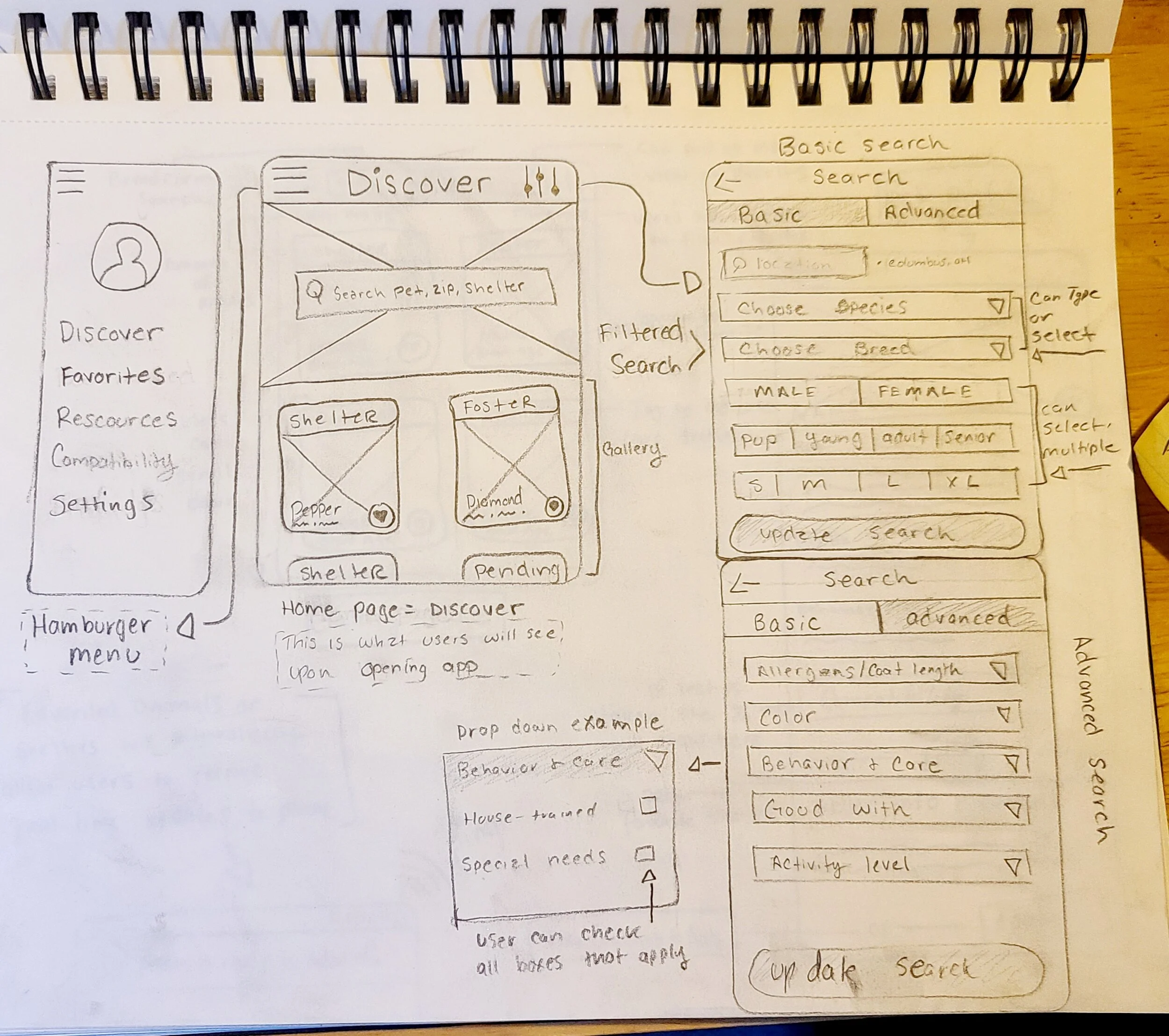
The Discover Page
When users log into the app, the home page is the discover page, I wanted users to have the ability to quickly search without adding any unnecessary steps. An area of focus was the intensive filter/search options. In the top right corner lies a filter feature where users can take their searches as in-depth as they desire. Having a basic and advanced search was of importance to incorporate for efficient navigation. With having the option to type, drop down and select, or select multiple options, users can get as particular as they wish. The hamburger menu in the top left corner was implemented for easy navigation. Users have the option to:
See previous favorited items such as pet profiles & shelters
Have access to further resources on adoption processes and particular animal and breed information
Access to the compatibility quiz
and further app settings
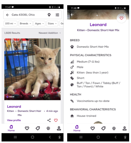
Browsing & Pet Profile Pages
A second ares of focus was easy navigation / digestible pet & shelter content. Whether users search for particular breeds or shelters there’s digestible content for both. The search bar leaves breadcrumbs to remind users what they’re searching for. There is also a drop pin to the right where users can click and see a map view of their search. This was important to add because searching locally was the number one factor when it came to pet adoption. More implemented designs:
Users also have a way to filter their results further if they desire
Easy favoriting options
Tags to indicate animals care status, whether they are at a shelter, in foster care, or pending adoption.
Name, breed, age on each pets profile
Once users click the pet profile page all information is laid out to be easily digestible. The pets information including: bio, health, behavior, shelter and care status. The pet profile page will also feature individual compatibility with the pet. If users have taken the quiz a percentile will show indicating how compatible their lifestyle is with the selected animal. If users have yet to take the quiz, it will prompt users before being able to apply for adoption. This feature was implemented to avoid the pet being incompatible after users decide to adopt.
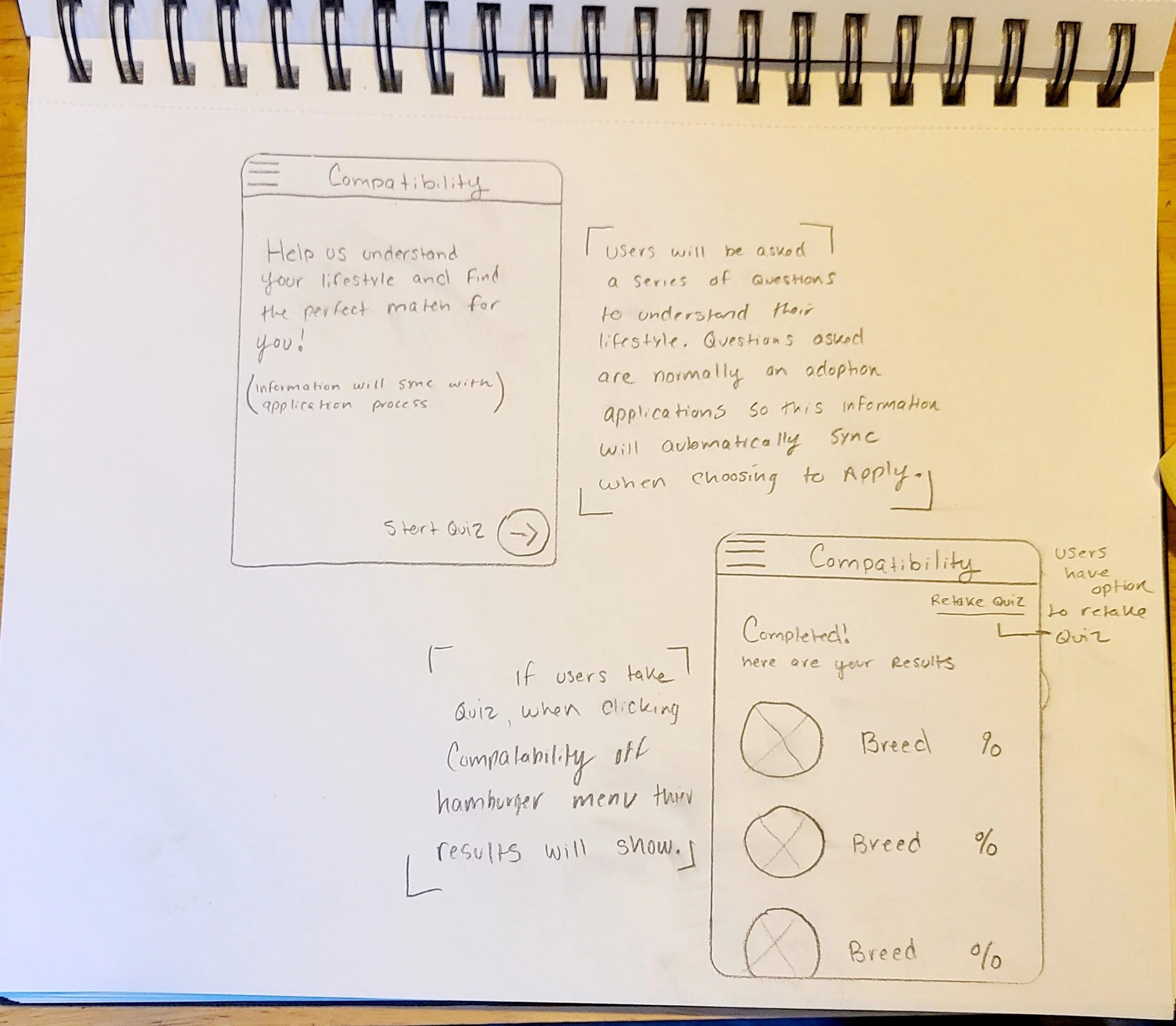
Compatibility Page
Like mentioned above the app will prompt users to take the compatibility quiz before being able to apply for adoption. This feature was implemented to avoid the pet being incompatible after users decide to adopt. I wanted to avoid this outcome as much as possible, to insure an easy process for the user as well as the adopted pet. This quiz will have similar questions that most adoption paperwork would have. This not only insures the users lifestyle matches the potential adopted pet, but also makes for applying much more efficiently as the information would sync when choosing to apply. Users will have the option to retake the quiz if changes in their lifestyle occur.
Next Steps
As time restraints where a huge factor with this challenge, to continue this project I would:
Build out more features
Create a digital mockup/wireframes
Conduct user testing
As always, conduct more research
Reiterate design based on feedback